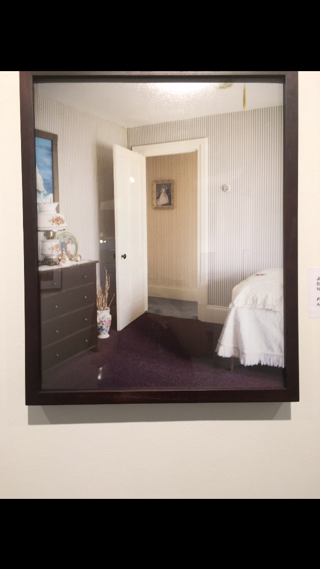
I really enjoyed walking around the alumni photography exhibition. It was really interesting to see previous students’ work no matter what year they had graduated. I liked a lot of different alumni’s work, but one picture really stood out to me out of most of them. Jillian Ryan’s photograph Family Portraits, was actually one of the pieces that really caught my eye. I thought that the photo was simple, and elegant, and also just plain beautiful.
What I liked most about it was that capturing a moment or a memory in time. I like how the center of the picture had the open door, like it was kind of inviting you to look closer into the photograph. I think that was what initially drew my eye to the photo. Then, my eye traveled to the picture in the hallway and I looking back into the room
What I liked most of this piece was the fact that it wasn’t taken up close, or zoomed in really close. Rather it was taken far enough way to include the other objects in the room which really added to the picture. The picture has a lot of depth because I noticed that what I assume to be a bed, and the dresser, point to the door, which leads back into the hallway. They are a contrast from the vertical lines that are represented by the wallpaper in the bedroom, in the hallway, the door frame, the lamp, the plant, etc. What I really liked about this photograph were the colors. They were the same sort of tone, and set the mood for the feeling of the room. I also noticed the different textures in the room, which I thought really tied the room and the photograph into a very appealing composition.
Most of the pictures in the alumni gallery were interesting, and very unique. I looked at this picture for a long time because it amazed me how simple it was, yet I thought it was stunning. A lot of the alumni’s photographs were really different from each others’ and I really appreciated the different styles of the artists.